Andros
Reframing how health plans design, build, and manage provider networks
Product
Arc
Category
UX Design
My Role:
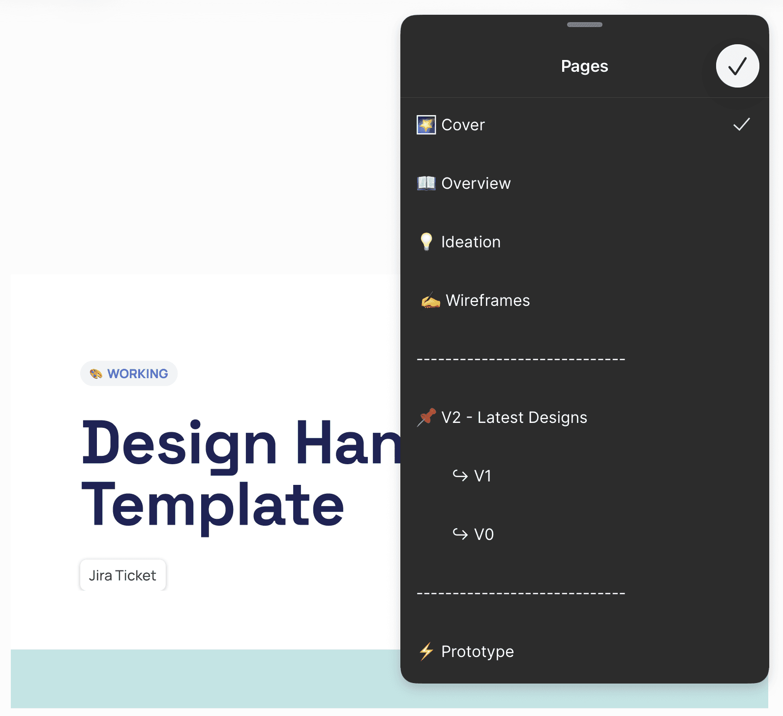
UX, UI, Dev Handoff
Tools Used
Years Worked on: 2
Project Overview
Andros Arc is a data orchestration hub that connects systems, aligns teams, and powers every phase of network management. This project was built with an MVP approach. I was the sole UX designer building a provider network management platform from the ground up. I owned everything from establishing the design system and crafting the UI/UX to creating a smooth handoff process with our dev team.
The problem statement
Healthcare is facing a transformation rising consumer expectations, increasing costs, and strict compliance requirements are pushing health plans to rethink how they manage provider networks. However, outdated directories, disconnected systems, and manual processes continue to slow progress.
User problems
Outdated and clunky technology
Many organizations still rely on Excel spreadsheets for tracking provider data, with health plans requiring hard copies of information instead of digital formats.
Disconnected data silos
Data updates in one system aren't shared with other systems, forcing staff to manually update the same information across dozens of different platforms.
Endless manual processes
Payers must employ entire teams just to make account updates, while providers face constant information requests from an average of 20+ different health plans.
Rapid data decay
Between 20% and 30% of directory information changes annually, making it difficult to keep records current.
The Solution
A Network Lifestyle Platform
Think of provider networks as ecosystems that are constantly evolving. Predictive analytics help design smarter networks, track performance, and put those plans into action by linking up existing systems. The best part? New opportunities to strengthen and grow the network along the way.
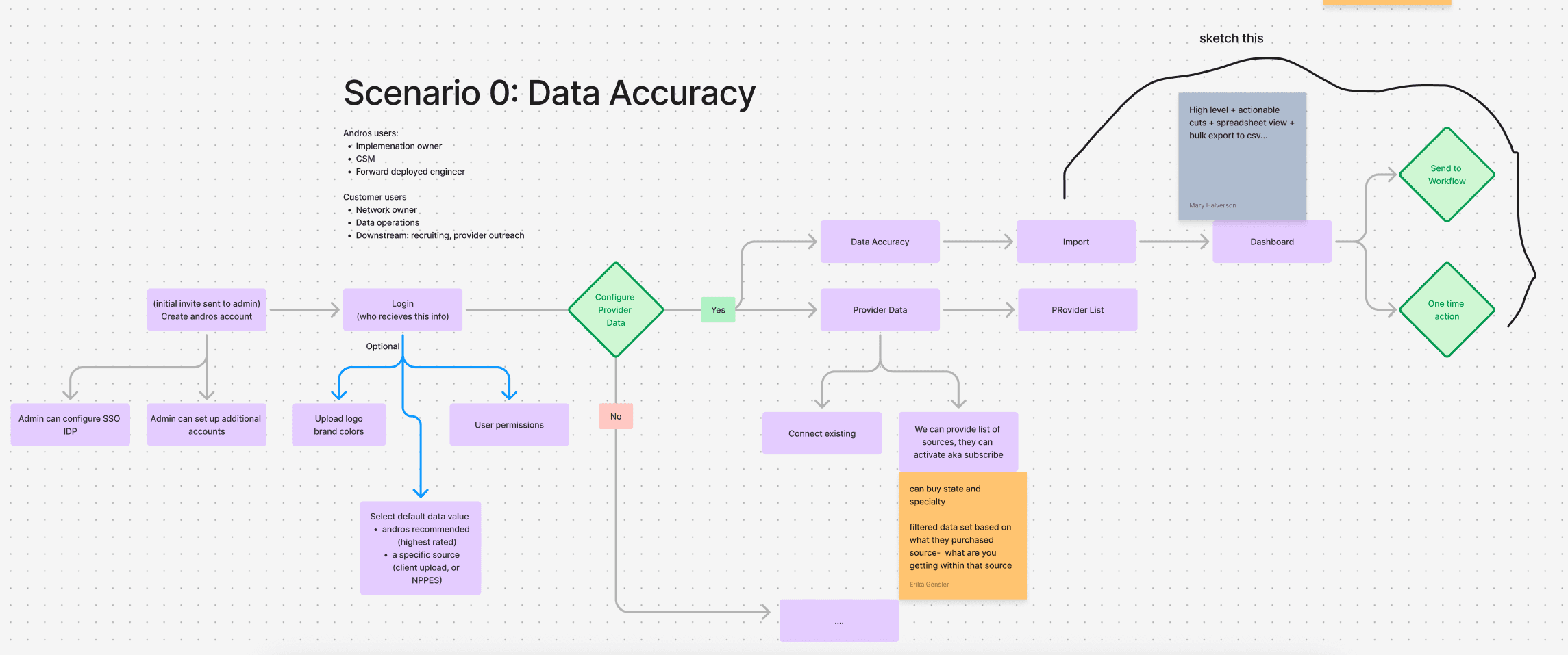
Discovery
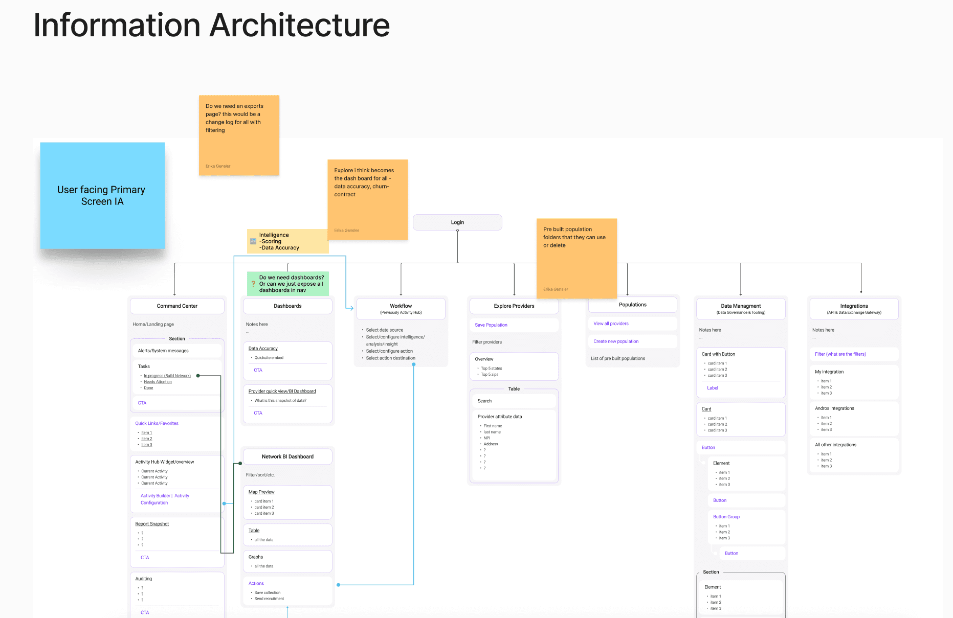
Building Arc started with really understanding who would use it and how. We used three main UX discovery methods, archetypes, information architecture, and journey mapping into move from "we think people need this" to actually building something that worked for real workflows. These three discovery methods didn't work in isolation. The archetypes informed who we included in our journey mapping sessions. The journeys revealed which information architecture decisions would have the greatest impact on daily workflows. The IA structure influenced how we presented archetype-specific dashboards and views.

Designs
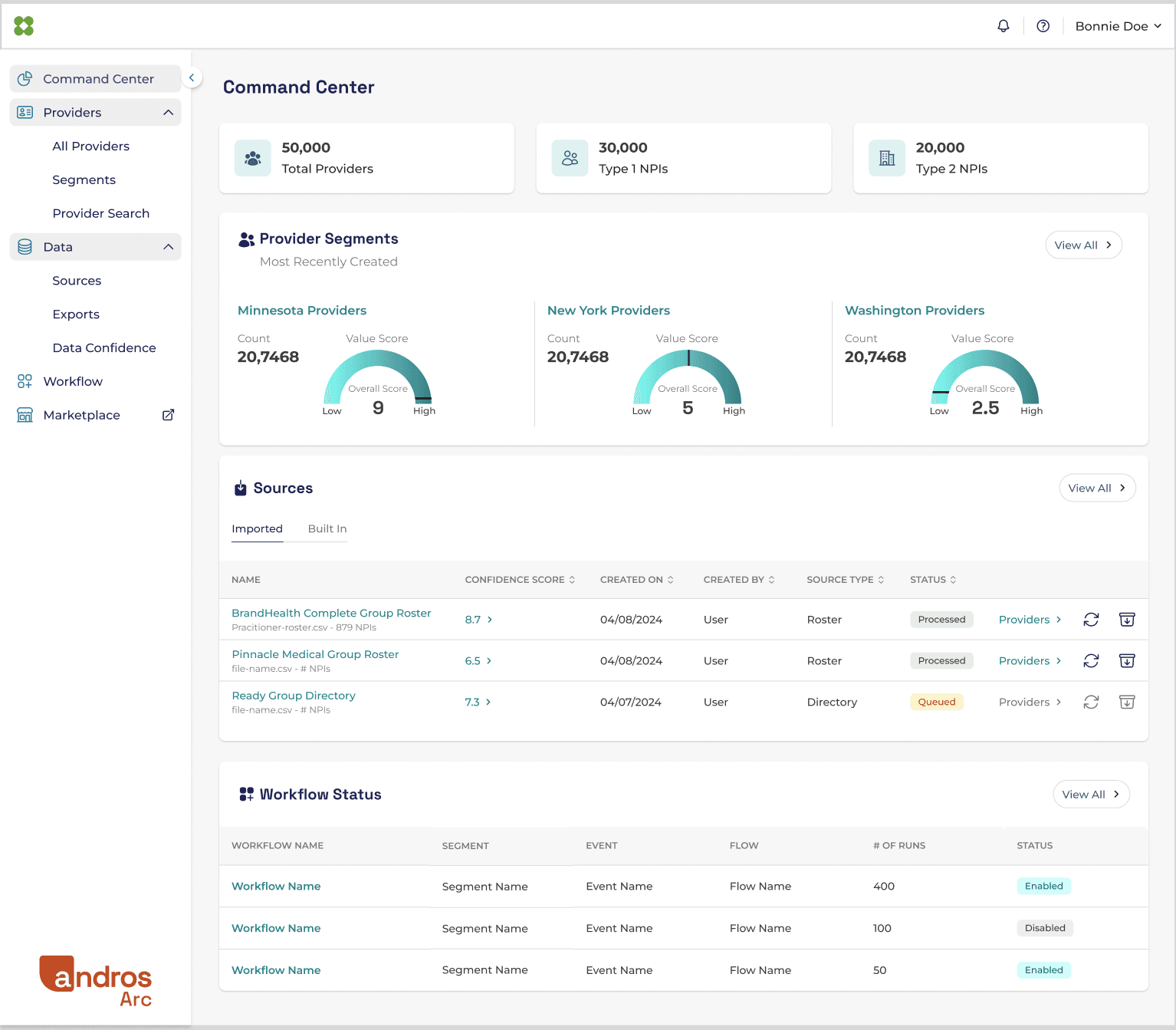
Command Center
This centralized view allows healthcare organizations to manage large scale provider databases efficiently, monitor data quality across different segments, track data ingestion from multiple sources, and ensure automated workflows are running properly.
What worked: Quick data snapshots of the platform where users can take more action.
What didn't work: Not tailored enough for specific archetypes.
What I learned: Because our initial outreach was limited, the resulting screens were built for a generalized user rather than multiple archetypes. I’ve learned that user recruitment is a non negotiable item. I now push for a research first roadmap where we validate archetype specific needs before a screen is developed.
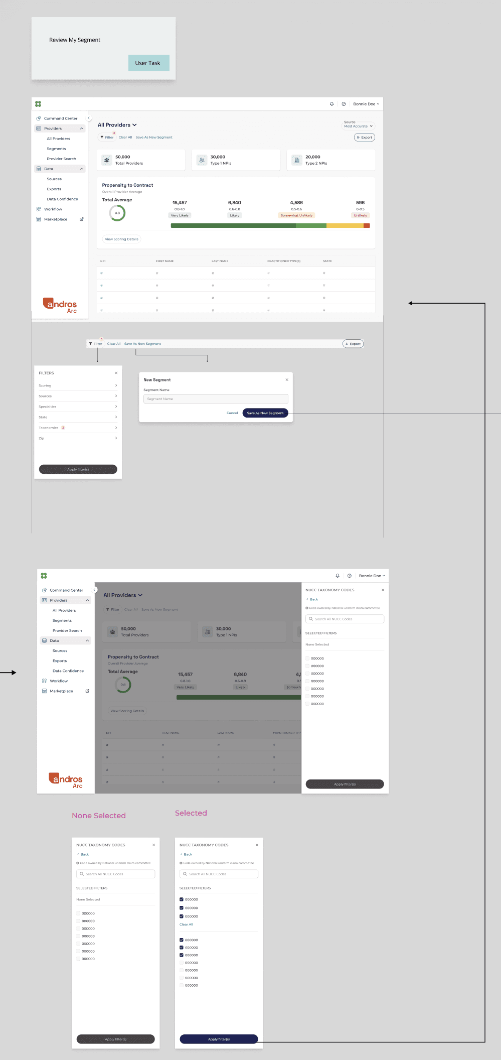
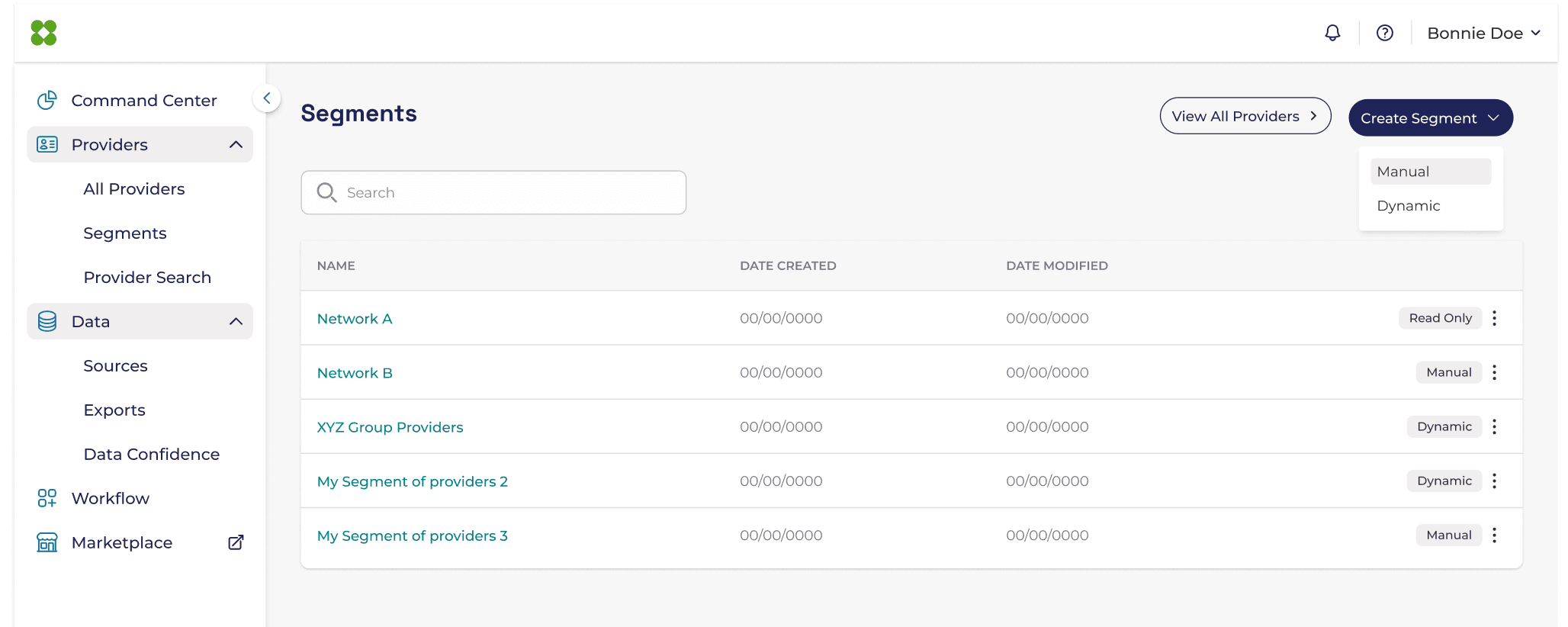
Segments
Users can create a targeted segment of healthcare providers based on specific criteria, which you can then export to a CSV file, send directly to an automated workflow for follow-up actions, or use to track and monitor data accuracy metrics over time.
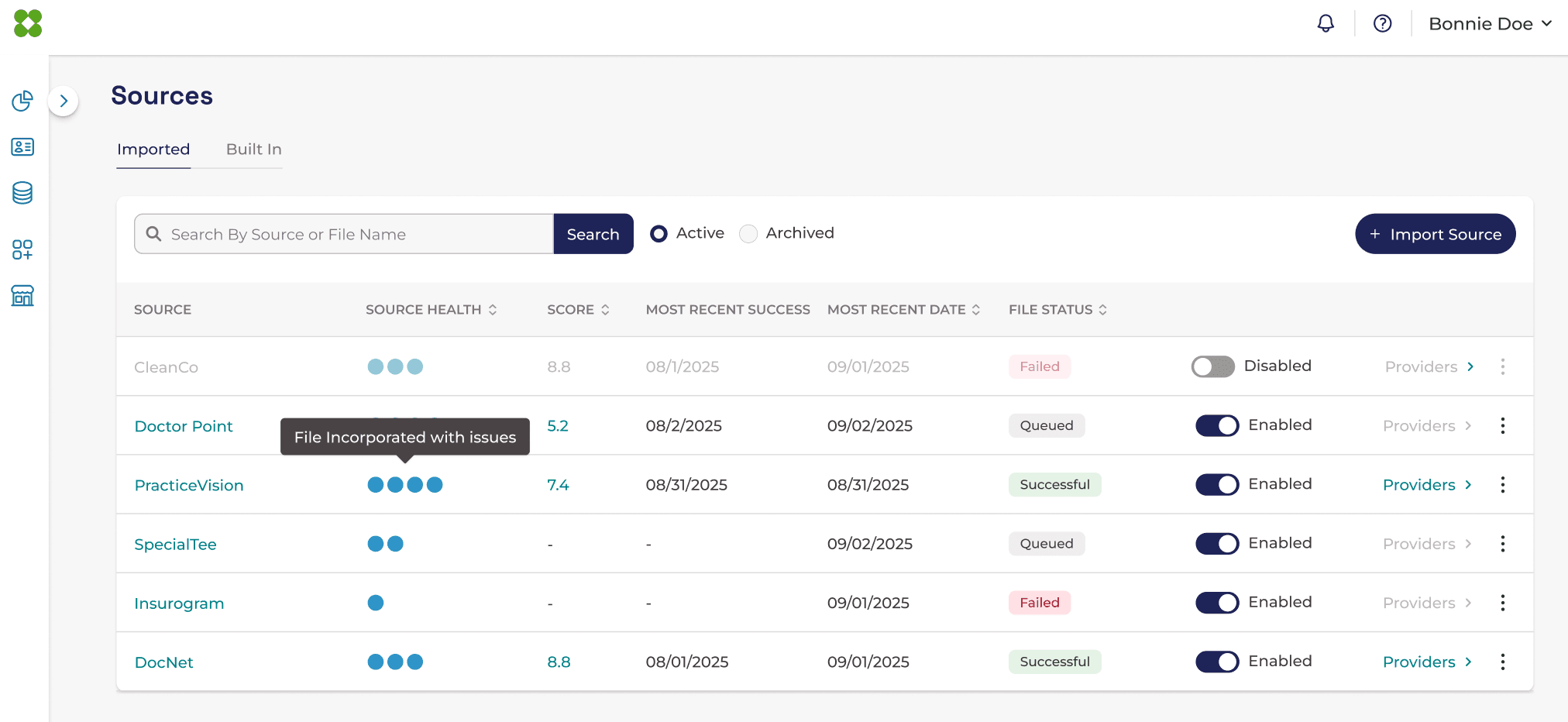
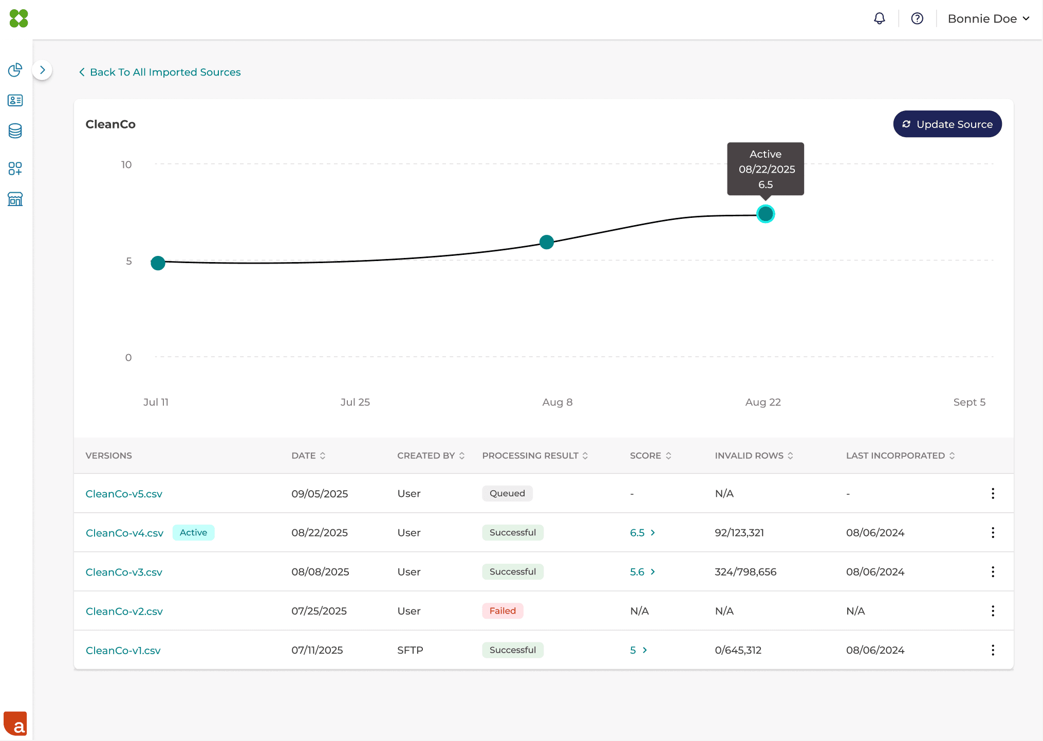
Sources
Users have flexible options for populating their provider database in Arc. They can import provider data from their own existing sources and systems, or leverage Arc's built-in sources that are provider data repository to automatically populate and maintain accurate provider information.
What worked: Displaying sources with historical accuracy scores gave demo users a clear signal for which sources to prioritize and which to cut.
What didn't work: Pairing a complex source health indicator with a data accuracy score overwhelmed users, the two concepts were hard to parse together.
What I learned: I'd advocate earlier and more strongly for fully validating the core feature in this case, the data accuracy score before introducing new ones.
Data Confidence
Provider data accuracy is a major problem in healthcare. The most common errors are outdated addresses, incorrect phone numbers, wrong insurance acceptance information, and "accepting new patients" status.
The challenge is that provider information changes constantly practitioners move offices, join new practices, change insurance contracts, or retire and these changes need to propagate across potentially dozens of different systems and directories. The data confidence dashboards utilizes scores to show users how accurate each data point is within that source they are looking at.

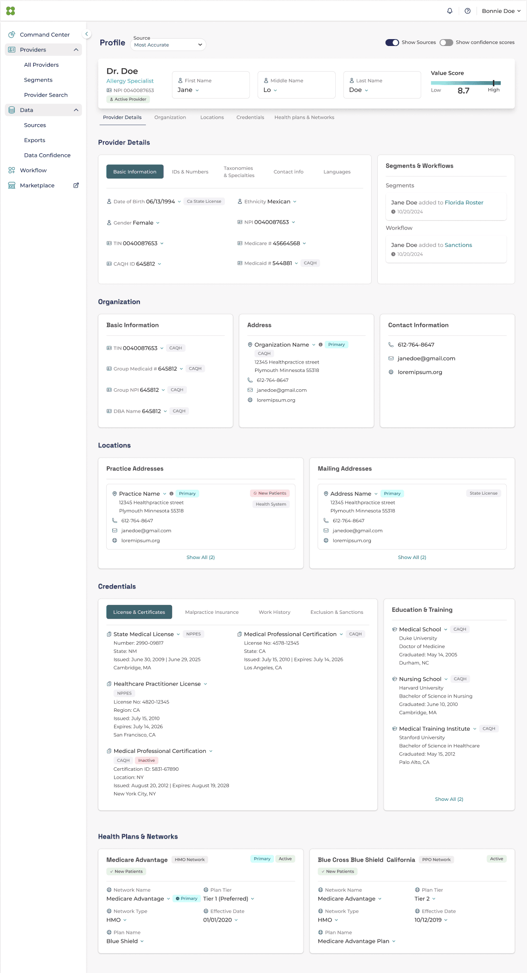
Provider Profile
This centralized provider profile view saves users time by eliminating the need to search multiple sources for provider information, insurance networks, and credentials. The information displayed is defaulted to the most accurate source data, although a user can switch to any data source.
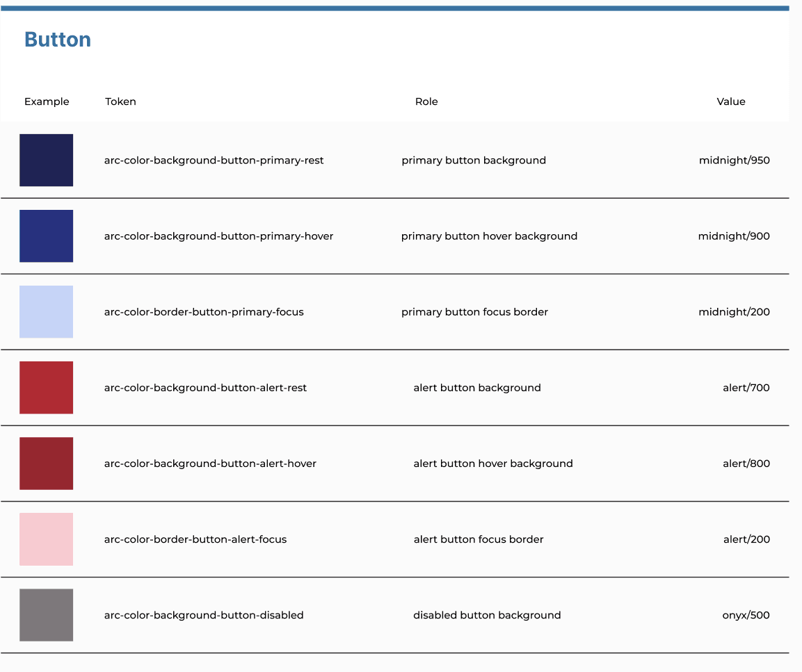
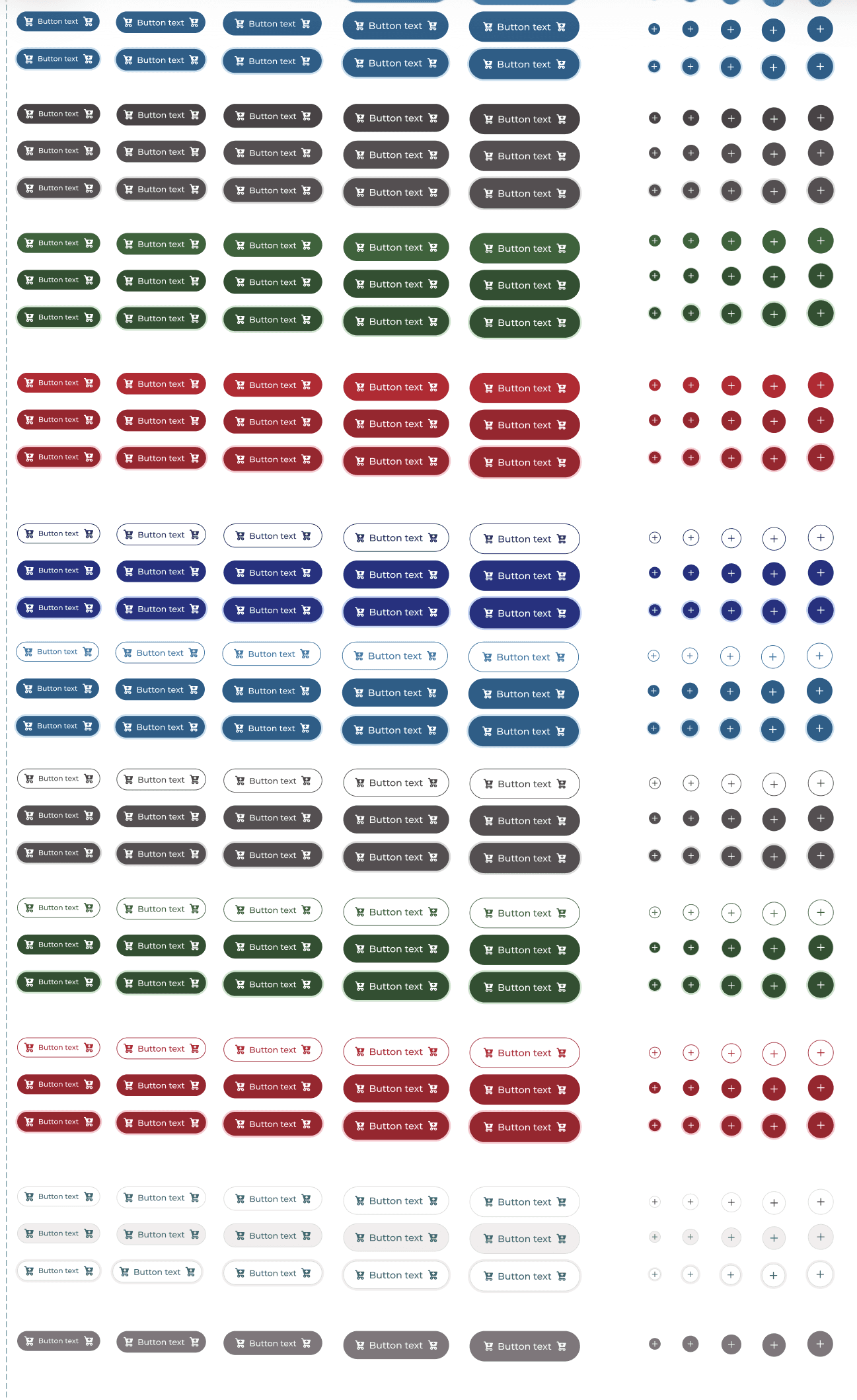
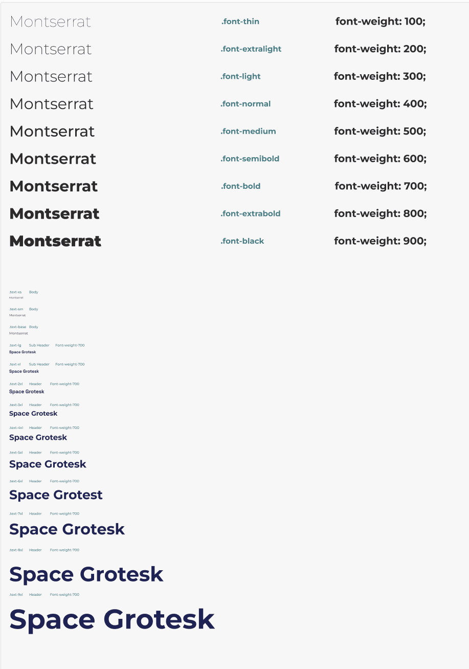
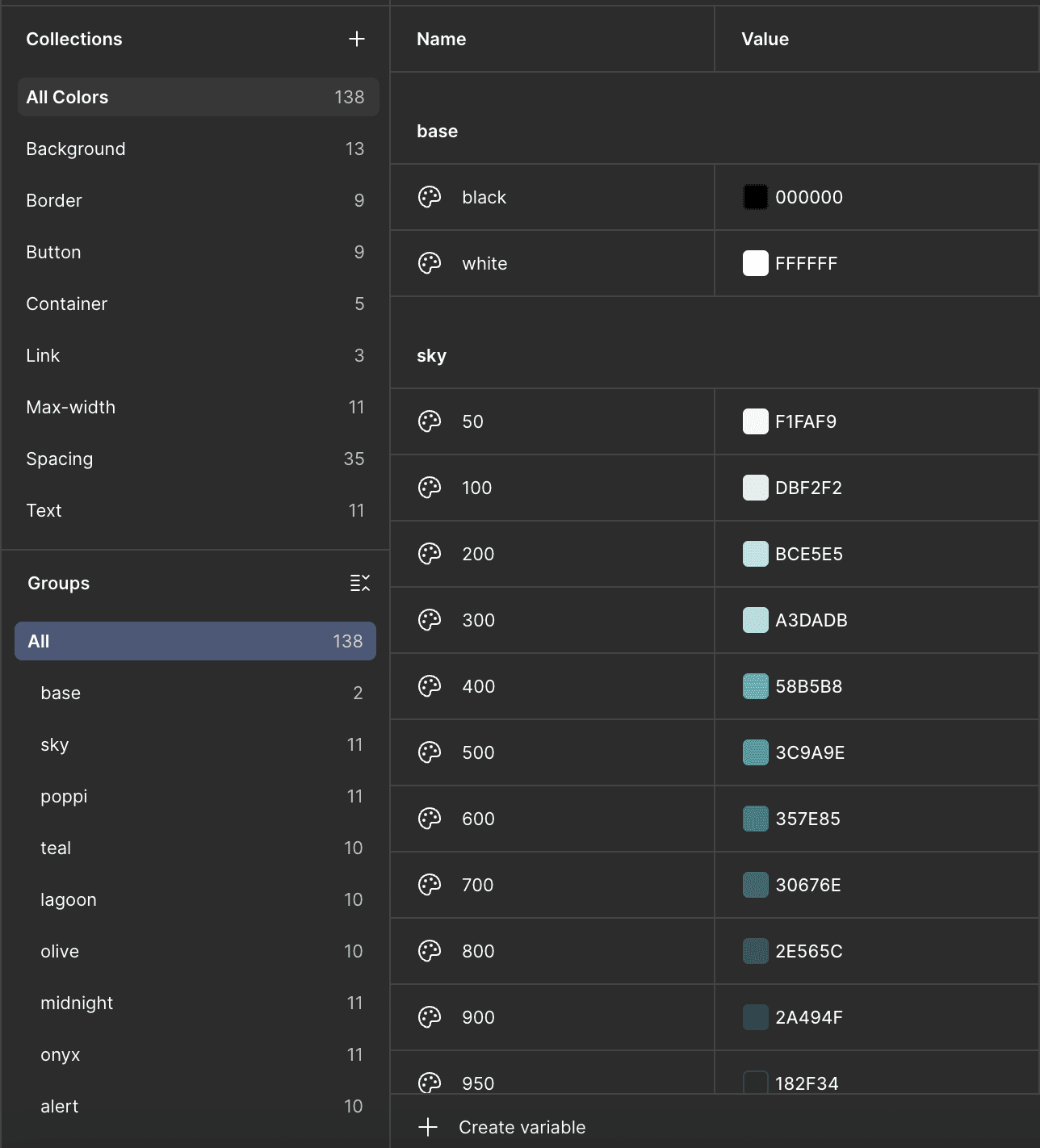
Design System